The 7 Core Principles of Design
With the rise in popularity of programs like Canva, graphic design is becoming accessible to anyone. However, without an understanding of the core principles of design, you can’t make a compelling visual, no matter how easy the software is to use.
Good design comes from understanding the basic principles of design. If you know the rules, you can learn how to bend them. Once you are aware of what makes a design aesthetically pleasing, you can use those skills to make compelling graphics of your own.
Here are the 7 core principles you need to understand in order to make a good design.
Terminology
Before we get started, it’s important to understand some key terms that people use to describe designs.
- Color: The general term used to describe the combination of tint, hue, tone, and shade. Black, white, and gray can be called a color.
- Color theory: The study of the universal human perception of color.
- Gradient: The gradual transition from one color to another.
- Hierarchy: The way elements are arranged that inform their visual importance.
- Hue: One of the 6 primary and secondary colors. The specific term that refers to the dominant color family. Black, white, and gray are not hues.
- Kerning: Adjusting the space between letters.
- Leading: Adjusting the space between lines of words.
- Opacity: The level of transparency of a design element.
- Palette: The colors chosen for a design or brand.
- Shade: A hue with black added to darken the color.
- Tint: A hue with white added to lighten the color.
- Tone: A hue with gray added to neutralize the color.
- Typography: The aesthetic choices made concerning text in a design.
Line

The incorporation of lines is what leads a viewer’s eye along the visual journey you want them to take. For example, underlining something shows the element’s importance, which informs its place in the visual hierarchy. You create a visual hierarchy by drawing your viewers to the focal point by the arrangement of lines. You create visual order or chaos depending on your use of lines. Lines can be straight, or they can be organic.
Change the impact of each line by adjusting the visual weight of the line. Altering the thickness will change the importance of the line. Choosing the color of the line will also impact its value in contrast to other design elements.
Color

Color informs the mood of your design. Choosing high contrast colors will make the design pop. Lighter tints of color make the design calmer. Shades of color inform intensity. Using warm colors will give the viewers a sense of urgency, while cool colors can make the design feel comforting.
White space, or negative space, makes a design feel uncluttered and serene.
Color theory is a complex subject that requires a lot of research. There are whole college courses devoted solely to understanding color theory. The terminology alone is extensive.
Value

Value is developed through your contrast balance. No one color has a specific value; the values are determined in relation to one another.
You can make a design really pop by adding a more contrasting value to a design element against the background you’ve chosen. Since value is relative, a blue design will have a different value against a white background then it will against a black background.
Texture
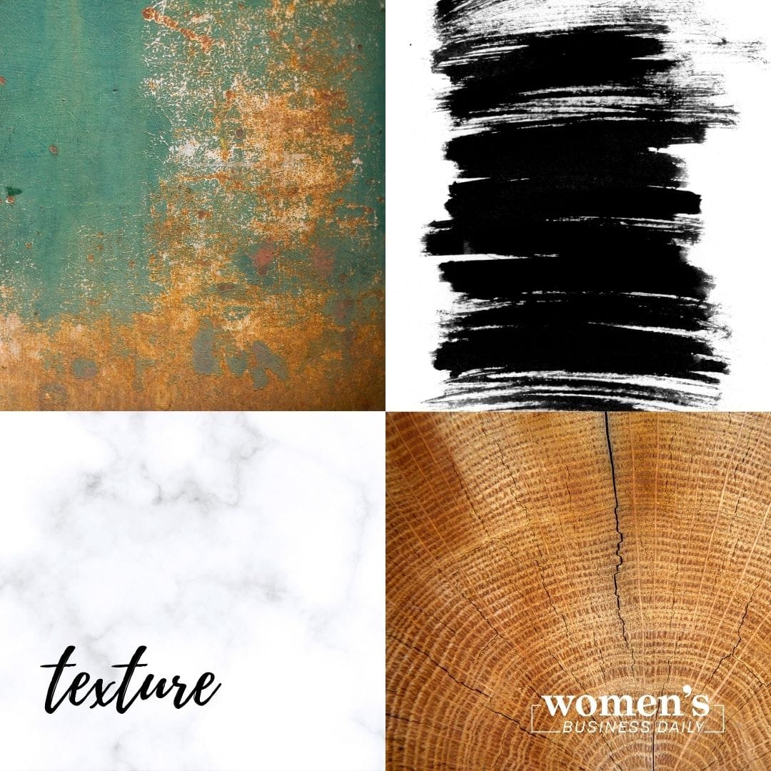
Want to deepen the impact of your colors? Give them texture. With good design, you can make even a digital image feel like it has a tactile experience.
Here are different visual elements you can use in your design to give it texture:
- Sand
- Fur
- Nature
- Fabric
- Paint
- Crumpled paper
- Architecture
Size

Size plays an important role in the visual hierarchy. Larger elements are more visually important, as your eyes are drawn there first.
The title of a piece is usually the largest because that is where you want the reader’s eye to start. Other important pieces could be the subject of a photograph or an important visual element and making those larger increases their impact.
Shape

Different shapes invoke different feelings and visual interest. Choosing a square shape will play more into a rigid, polished tone while choosing an organic shape makes the design elements feel freer.
Visual elements work together to create the flow of the visual hierarchy. You can play with the feeling of the piece by using only organic shapes, only rigid shapes, or a combination of both.
Space
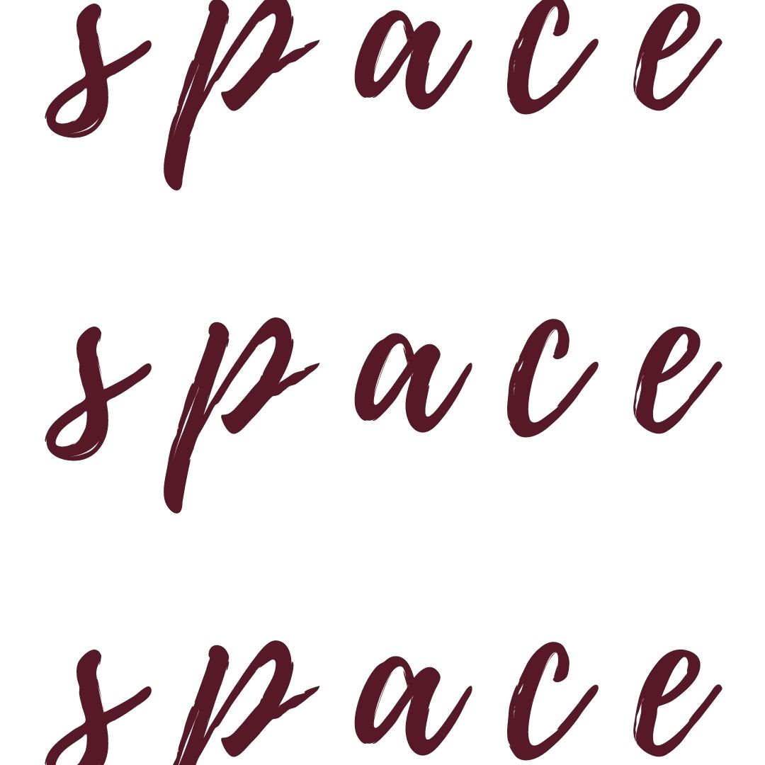
How much or how little space you add between elements will inform whether the design feels clean or cluttered. Adding negative space gives the design room to breathe, and the design won’t feel as overwhelming.
Negative space is a good example of how every decision to include or not include something informs the design.
The Most Important Principles of Design
The most important part of design is making something that expresses who you are or your brand is. Every decision you make must be deliberate. Including something and excluding something both are choices and impact the overall aesthetic of the piece. Make sure you have strong copywriting to incorporate into the design, because the aesthetics alone can’t carry the piece.
Do the principles of design still feel overwhelming? When you sign up for Women’s Business Daily, multiple tiers include free Canva templates for you to tweak and use in your business. We’re here to help your social media stand out, even if you aren’t ready to design on your own yet.
Author, Artist, Photographer.
Sarah Margaret is an artist who expresses her love for feminism, equality, and justice through a variety of mediums: photography, filmmaking, poetry, illustration, song, acting, and of course, writing.
She owns Still Poetry Photography, a company that showcases her passion for capturing poetic moments in time. Instead of poetry in motion, she captures visual poetry in fractions of a second, making cherished keepsakes of unforgettable moments.
She is the artist behind the Still Poetry Etsy shop, which houses her illustrations and bespoke, handmade items. She is the author of intricacies are just cracks in the wall, a narrative poetry anthology that follows a young woman discovering herself as she emerges from an abusive relationship.




Responses